
Envoy Sign-in Flow: getting to 30 seconds
Overview |
The visitor sign-in flow is Envoy's core experience that hundreds of thousands of people touch every day. It needs to be fast and simple—both for the many first-time users and for those who must sign in multiple times a week. The basic flow had remained largely unchanged for over 4 years. The design team explored a new flow that simplified the different permutations and sped up the process for all visitor types. The result was a 25% reduction in sign-in time and a simpler foundation on which we can add new functionality in the future with fewer missed edge cases. |
Product |
Envoy Visitors helps you welcome guests to your office with a beautifully simple visitor management solution that keeps your workplace safe and saves your team time. |
Team |
Head of Design (me), 1 product manager, 1 product designer, 2 engineers |
Launch |
February 2019 |
Problem
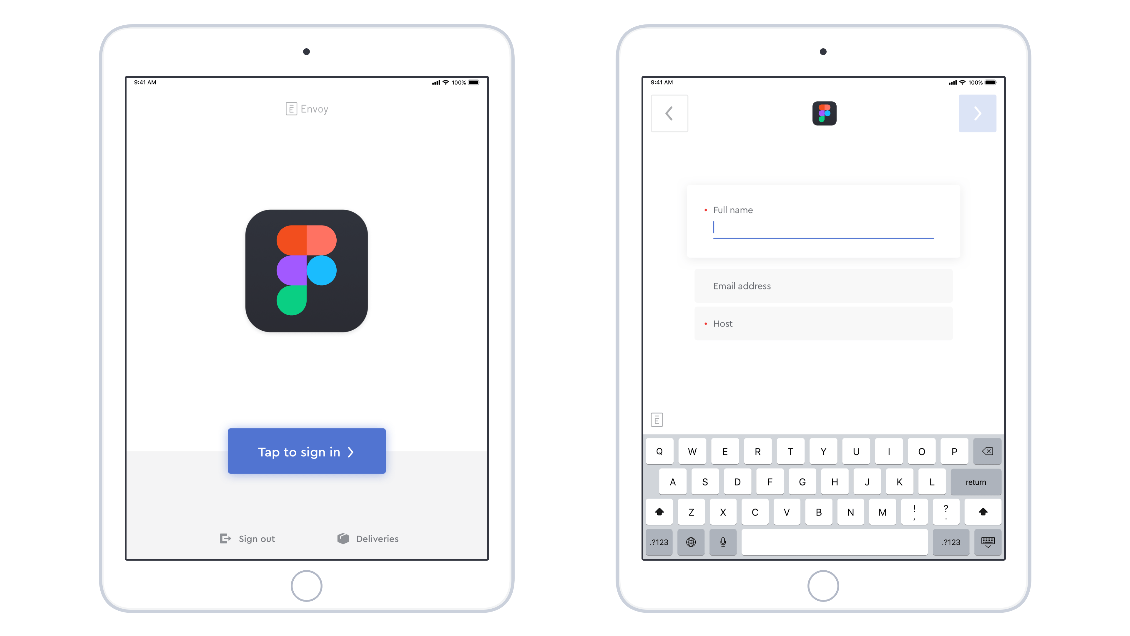
At its core, Envoy is just a basic form. Though with features like visitor pre-registration, integrations, and remembering repeat visitors, we actually know enough about visitors to save them a lot of typing. However the iPad app didn't take advantage of that rich data in a useful way, resulting in a lot of unnecessary typing and longer sign-in times.
We also had a feature called "Been here before?" which only works if returning visitors tapped a separate, much smaller button on the welcome screen instead of the giant button in the center. Most returning visitors didn't use it.
Hypothesis
If we split the sign-in fields screen into two separate screens—the first just asking for the visitor's name—we can vastly simplify the sign-in process for pre-registered and repeat visitors.
Data Insight
We did some digging, and found that less than 0.5% of offices using Envoy have ever had two different visitors with the same name. Knowing that it was a (rare) possibility, we made sure to design the logic supporting this feature to protect visitors' privacy and create a great experience for everyone... even if they fit an edge case.
User Flows
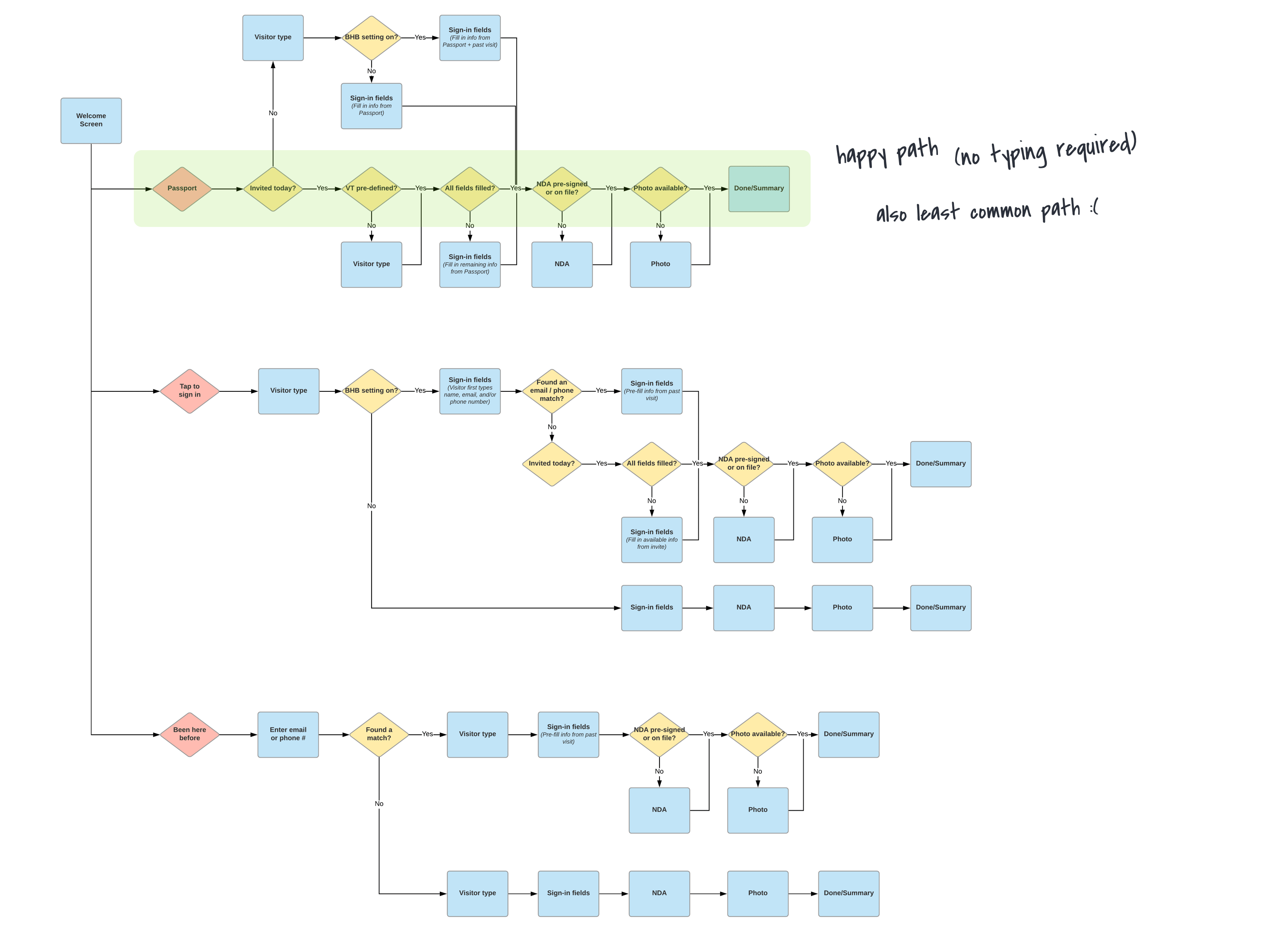
We wanted to make only minimal visual design changes during this project, as the main focus was refining the existing flow. So we spent a lot of time mapping out the various user flows to catch any trouble areas.
Before
After
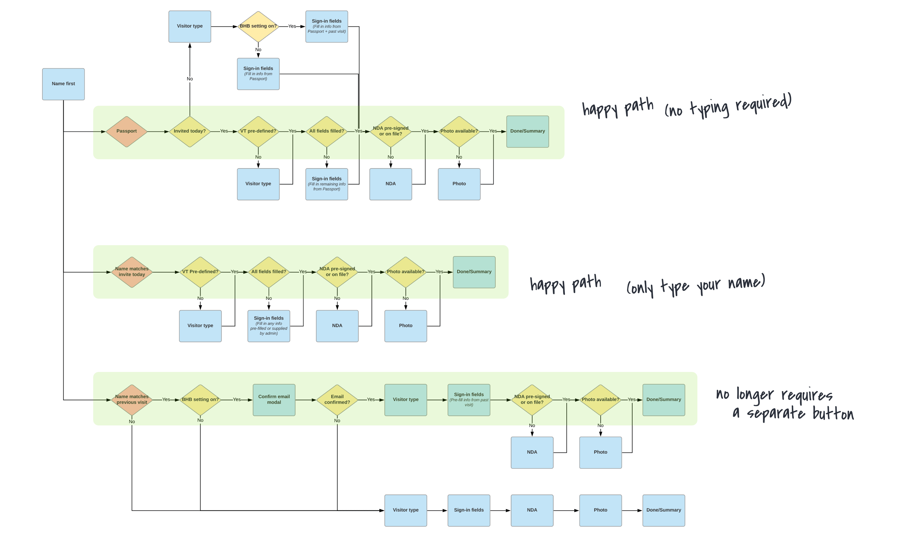
Our refined user flow provided three options:
- If a visitor signs in using Passport (our companion mobile app for frequent visitors) all information is transmitted automatically, including their security photo. No typing required at all.
- A visitor who was pre-registered for today only needs to type their name. Any existing information is recorded automatically, and any missing information (for example, their photo) is requested during sign-in.
- A returning visitor (not pre-registered for today) must confirm their email address first, protecting their privacy in the rare case where a new person with the same name is visiting instead.
Final Designs
Results
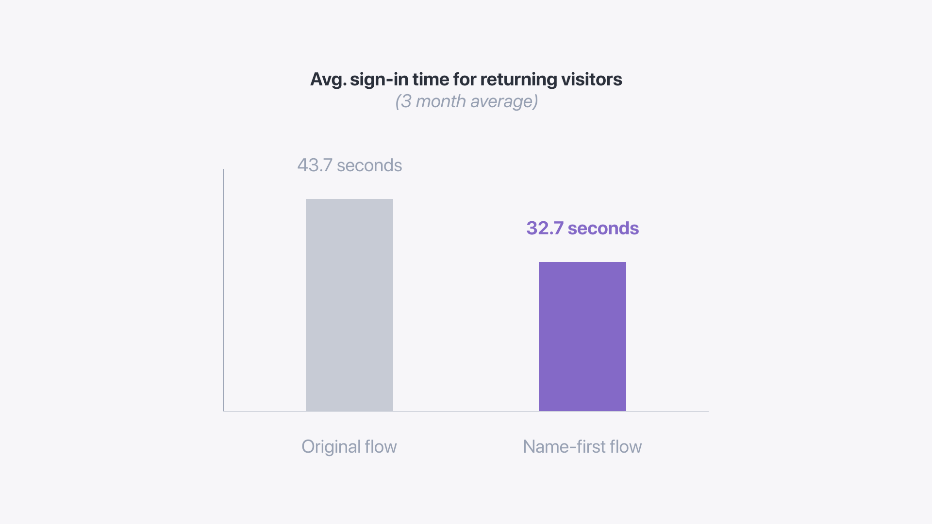
After releasing this feature, we compared average sign-in times across all customers and locations with historical data. Our baseline average was 43.7 seconds, and the new flow average was 32.7 seconds—25% faster. (This measurement was taken 3 months after release)
Feedback and Learning
This project seemed like a clear success, right? It turns out that making changes to our core user flows had some unintended consequences that we didn't expect. Even though we had gone out of our way to catch "edge cases" we received some customer feedback that our new flow broke their process. They easily adapted, but didn't appreciate the abrupt change.
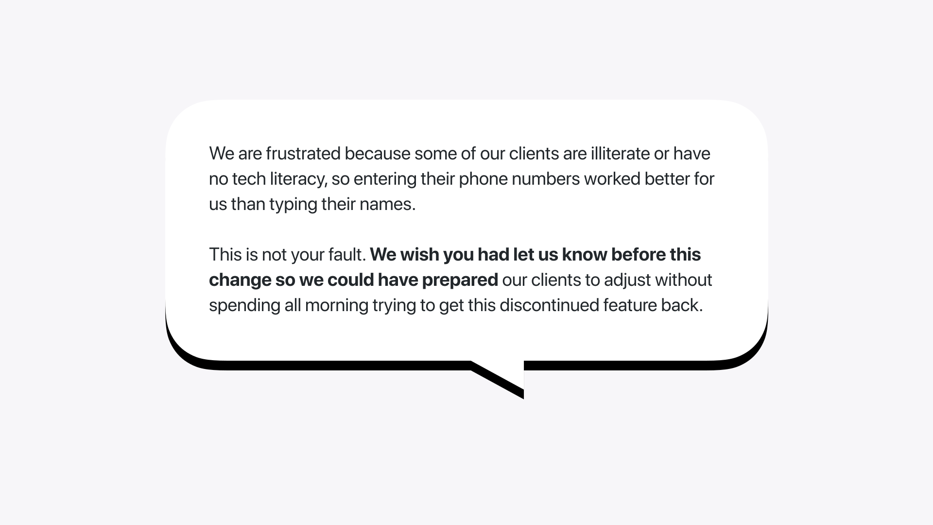
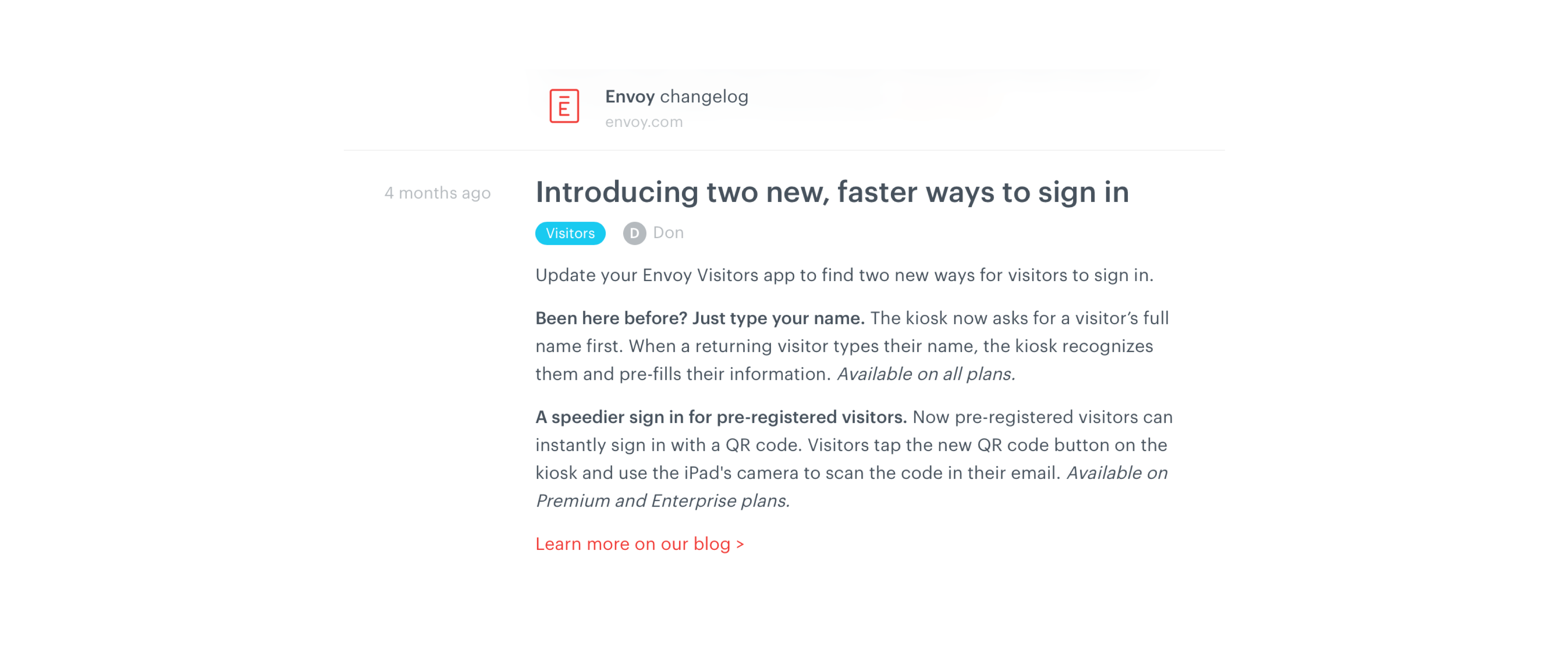
As a result, we adopted a new process for notifying customers about upcoming changes and releases in a lightweight but informative way. We created a changelog, made product marketing emails more frequent and detailed, and looped in our Customer Success team so that managed accounts weren't left out.
···
In Closing
The name first flow was ultimately successful in several ways: we simplified our core visitor experience after years of stagnation, paving the way for new functionality without creating a huge tangled mess. Visitor sign-in was now faster and easier. And we tightened up our customer communications process to keep our users in control and in the loop.
Most of the credit for this project goes to Jon Rundle, the product designer. He originally came up with the idea for moving the name ahead of the other sign-in fields, and we worked together to refine the flow, catch edge cases, and get this prioritized on the roadmap. 🔖